UX/UI app design
Habitat
Skills UX/UI research & design, wireframing, prototyping
This app is designed to streamline and simplify the experience
of searching for properties to rent or buy. Unlike competitors,
the user experience facilitates easy navigation and use.
Please scroll down to see case study for this project.


WHAT’S THE PROBLEM?
When I started my search for my dream apartment, I began in the usual way by using the primary property apps available. Having just completed a course in UX/UI design, I instantly realised that there was a lot that could be improved!
I dug a little deeper, perhaps there was a kick-ass property app out there in Australia but I just hadn’t found it yet. Alas, there was not. So, I set about making one.
The problem was that the two primary apps were confusing, clunky, messy, and lacked some of the prime functions that I needed. The goal was to figure out how I could improve this and give people an app that was instinctive and easy to use.
THE RESEARCH
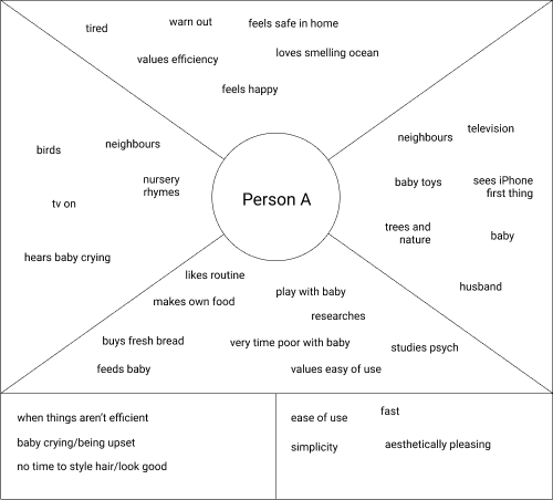
This was just my opinion though. Did other users have the same issues I was having? Yes and no. I began my research by carrying out both qualitative and quantitative research on a range of ages and genders and creating empathy maps and forming a persona (below). It was important to find out if other people thought there was room for improvement but more importantly, what they felt they needed from a property app.
The key findings from my research were:
TIME - we’re busy people so whatever can make our lives simpler and easier is successful
LACK OF INFORMATION - users felt frustrated with the lack of information available per property
DEALING WITH AGENTS - 53.8% didn’t enjoy dealing with agents
LARGE CROWDS - 53.8% didn’t like the large crowds at house inspections
GETTING IT RIGHT - 92.3% of users found it hardest to find their ideal home
GOOD ADVICE - 46.2% felt it was hard to get trustworthy advice on buying or renting property
UNDERSTANDING IT ALL - 38.8% of users found understanding the property vernacular hard
THE ANALYSIS
Armed with all of this, I used card sorting to identify which were the most important qualities the user needed and what elements weren’t really working from the current apps on the market.
This app had to be:
easy and intuitive to use
helps ease the stress and overwhelming element of searching for property
give more control back to user so that they can rely less on the real estate agent
offer a solution that enables user to avoid large crowds at inspections
provide trustworthy advice and helpful information on renting/purchasing property
THE IDEAS
Based on everything I had discovered so far, it was becoming evident that I didn’t need to drastically shake up the existing app model but provide clearer navigation and remove the elements that were unnecessary.


